
Digital Fundraising Playbook Series: Creating a Compelling Website Giving Experience
Introduction
Raising money online is about much more than setting up a donation form and adding a picture of a happy puppy. Think of your online fundraising program as a funnel that attracts many different people to the wide top of the funnel. As the funnel narrows (via targeted communication, asks and calls to action), the funnel channels folks right where you want them to be (and where they want to be) in relationship to your organization.
The experience of online giving has many moving parts, including the homepage, one or more landing pages, donation forms and stewardship tactics. You need time and experimentation to get the various parts humming along in unison.
Program Composition
The homepage
You’d be surprised how many nonprofit and municipal shelters think about what they want to put on their homepage, instead of thinking about what their supporters want and need to see. Consider this: The vast majority of people who see your homepage have minimal knowledge about who you are, what you do and how they can help. They may have googled your organization and ended up on your homepage. They may be lost in a large municipality’s website. They may be struggling to find critical information to help a pet or family member. They may even be anxious or fearful about using the internet.
Your goal is to help them determine, as efficiently as possible, where to go to find what they need and to do so in a way that reinforces their initial interest in helping. In the fundraising arena, this almost always begins with the unspoken question of why they should give to support your work.
The case for support
If you’ve worked in animal welfare for many years, that question might sound crazy: Isn’t it obvious why donations are needed to save animals’ lives? But many people who care about animals are completely unaware of the challenges faced by shelters or the changes now occurring as animal welfare moves toward community-based sheltering.
These are the people you want to target on your homepage. They need the whole story, not just one small piece of it. When fundraisers want to tell the whole story, they create what is called a case for support. It includes elements like these:
- What is the need or the problem to be solved? Example: We need to save the lives of homeless pets.
- Who benefits if we meet that need or solve that problem? Example: The homeless pets, but also the families who foster or adopt the pets, and the communities in which they live.
- What can supporters do to make a difference? Examples: Donate, adopt, foster, volunteer.
- Why support this organization? Example: We’re having a big impact, and here are links to stories and statistics to back up that claim.
- Why should you act now, instead of waiting? Example: There are pets in shelters right now who need loving homes. You can make a real difference today.
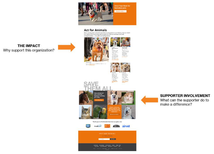
- If you look at a snapshot in time of the Best Friends homepage (bestfriends.org), you’ll notice that our homepage is an almost literal reflection of that case for support.
While the work described at bestfriends.org may be more complex than your work, the principles and value of a case for support apply to all lifesaving organizations. If you are new to the concept of a case for support, check out our Fundraising Fundamentals course, lesson 7. Then present your best case for support on your own homepage.
A choice: landing page vs. straight to the donation form
Once your supporters see a call to action (whether on your homepage, in an online ad or on social media), you have two options: send them to a landing page where they learn more about why taking that action would be a good thing, or send them straight to a form where they can take the action immediately. Which option should you choose? The answer is often “both” and sometimes “it depends.” Take a look at the upper right corner of the bestfriends.org homepage:

Supporters see two options: a big orange Donate button and a Ways to Give tab. The option that a supporter clicks depends on how “qualified” the supporter is. Qualified people have the context they need to give immediately and will likely click on the big orange button. They’ve already decided they want to give, and they just need us to get out of their way and let them do it. The qualified people can go straight to a donation form.
Non-qualified people are the opposite. They don’t have the context they need to give yet, and they want more information or answers to questions before they’re ready to respond to a call to action. They might need to understand our case for support a bit better, or they might need to decide what type of gift they want to make (e.g., recurring, one-time, memorial or even bequest).
You need to give non-qualified people more context about your case and/or inspiration before they’re ready. That’s what a good landing page does: It strengthens the case for why people should give to your programs generally or to a particular program (like a giving club or monthly giving program).

Crafting a good landing page
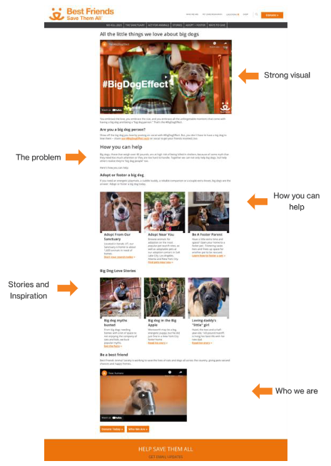
Take a look at the landing page that Best Friends created for a campaign about big dogs. If all your landing pages have the following elements, you’ll have a great foundation for your digital fundraising program.
First impression: Note the strong, positive visual at the top. We want to inspire people with the happy ending we hope to create together. (See our playbook on choosing images for more information.) Review the primary page elements and think about how you would create something similar with your own content and images.
The problem: At the top, you want people to understand the problem you’re trying to solve through this effort. Use simple language, similar to what you would use when talking to friends or family, not formal language you might see in a press release or financial report. You want to make sure people understand who benefits from solving the problem and why acting now is urgent.
How you can help: In most fundraising efforts, your supporters are the solution. Yes, your organization may have some special sauce to make it more effective than others, but ultimately the supporter is the protagonist of this story. You want to present the solution as the natural outcome of what the supporter is doing (in partnership with you).
In the big dog campaign example, the call to action isn’t money, but it will be for any fundraising call to action. Make sure that you have a very large brightly colored button for people to click to lead them to the donation form.
Inspirational stories: To promote emotional engagement, it’s always a good idea to have stories that feature the positive impact of your past work and connect that impact to what supporters have the opportunity to do now. Those stories should include a call to action pointing back to the donation form so that as soon as supporters are emotionally engaged, they can go straight to that form without having to hunt for it.
Who you are: One of the biggest mistakes made by organizations is the assumption that all members of a community know what the organization is about and are ready to give. At the bottom of each landing page that Best Friends creates, we include a link to our story and our mission. If potential supporters end up on a landing page without really understanding what makes us tick, they still have an opportunity to get to know us.
The donation form
If you’re sending non-qualified people to a landing page instead of straight to a donation form, then you should be able to assume that the people who arrive at your donation form are ready to donate. All you need to do is keep the form simple, clear and straightforward.
Take a look at this Best Friends donation form. The text at the top reminds supporters that they are the protagonists in this lifesaving story, and that their action will do great things for the animals.
The specific amounts listed for consideration (called an ask string) should be tailored to the wealth of the people in your community and/or your target audiences. If you’re unsure, an ask string of $25, $50, $100 and $500 is a good place to start. Raise or lower it based on what you learn about supporters and potential supporters of your organization. (Best Friends uses a different form with a higher ask string for audiences of greater financial capacity.)
The rest of the form can be the default for the donation system you’re using. Keep in mind that every field you add tends to reduce the number of people who will complete the form. Collect only the information that you really need to thank the donor and process the gift. In your ongoing stewardship of donors, you can look for ways to collect more information.
The thank-you page and email
The donation form should direct people who have completed the donation process to a thank-you page. You might think that all you need to do is say thank you and give donors a receipt for their records, but that’s a missed opportunity.
The thank-you page is the introduction to a 12-month effort to get the donor to give again. People who donate a second time are substantially more likely to become lifetime supporters, so your thank-you page (and a follow-up thank-you email) should be a substantive step in that direction. Here are some tips:
- Thank donors meaningfully, not in 3-5 words, but in 3-5 sentences.
- Reinforce how much they are helping by making the donation: Talk about the lives that will be saved, the pets and families who will receive care and resources, the communities that will be engaged and supported.
- Talk about the impact that past donations have made, including any data you have about the number of pets saved in the past year or the number of people whose lives you’ve touched.
- Thank them again and close with expressing your gratitude for their action.
Then, give them a way to get even more involved. It’s very common to tell people to follow the organization on social media, but let them know what else they can do (e.g., foster, volunteer, adopt, become a sustaining monthly donor). There is an adage in nonprofit digital fundraising: Supporters never love you more than the moment they hit the submit button. Take advantage of this very special time in their relationship with you.
Welcome series
As you grow your programs, consider creating a welcome series for new online supporters. This consists of a series of emails sent to a new supporter the first week after the supporter has donated or opted-in for email from you for the first time. Google nonprofit welcome series for ideas and direction.
Conclusion
Lots of people claim to be able to build websites, but if you want to attract donations and build lifelong relationships with donors, you need to consider the ways in which your website supports the user’s giving experience. Key components of that experience include:
- Homepage (and case for support)
- Landing pages
- Donation forms
- Thank-you pages and related thank-you emails
- Welcome series and related stewardship of donors who gave through your website
As with all nonprofit technology, you will need to make choices. Putting the donor first as you make those choices will help ensure that your website serves you well.
In our digital playbooks, Best Friends is not endorsing any specific product, platform, or company. We share our knowledge of (and experience with) digital tools, and we strongly encourage every organization to research, test, and choose tools based on the organization’s specific needs.
If you found this playbook helpful, check out our full catalog of handbooks, manuals, and playbooks.